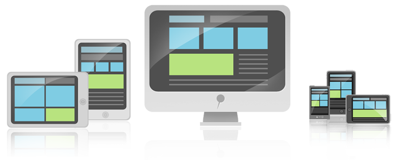
Responsive Web Design for Mobile and Tablet

Responsive Web Design is designed to deliver a compelling customer experiences across multiple devices.
Responsive web design is the building of a website that is suitable to work on every device and every screen size, no matter how large or small, mobile or desktop. Responsive web design is focused around providing an intuitive and gratifying experience for everyone. Desktop computer, laptop, tablet and smart phone users alike all benefit from responsive websites.
Why is Responsive Web Design So Important?
|
“With Responsive Web Design, you can create one well-planned site to deliver an optimized experience in context to each device or screen size.”
|
Responsive Web design is the practice of building websites that display based on screen size, platform and orientation. This consists of a mix of flexible grids and layouts, images and an intelligent use of CSS media queries.
As the user switches from their laptop to iPad, the website should automatically switch to accommodate for resolution, image size and scripting abilities. In other words, the website should have the technology to automatically respond to the user’s preferences. This eliminates the need for a different design and development phase for each new gadget on the market.
With Web users increasingly using mobile devices to browse Web sites and apps, Web designers and developers need to be sure that their creations look as good and work as well on mobile devices as on traditional desktop computers. Whether you design for mobile devices as a primary target or as a nice extra, you can use the power of CSS to ensure that the same content can be accessed across all hardware platforms, from mobile phones to wide-screen high-resolution displays.
Some Responsive Web Design strategies include:
Responsive Web Design Resources
The term responsive web design itself was coined and largely developed by Ethan Marcotte. Ethan’s book Responsive Web Design is a great place to get started learning about responsive web design and is a highly recommended read. Below are more responsive web design resources:
Overviews
- Responsive Web design, by Ethan Marcotte
- Beginner’s guide to responsive Web design, by Rick Petit
- Responsive Web design: What it is and how to use it, by Kayla Knight
- Multi-device Web design: an evolution, by Luke Wroblewski
Techniques
- CSS media queries reference page
- pointer Media Query, Pointers for Mobile devices, by David Walsh
- CSS media queries and using available space, by Chris Coyier
- Liquid layouts the easy way, by Russ Weakley
- Fluid images, by Ethan Marcotte
- Designing for touch screen, by Chris Kemm
- Responsive Web Design Techniques, Tools and Design Strategies, by Smashing Editorial Team
Tools
- Responsive Design View in Firefox

